Tuesday, 13 December 2011

Year 2 - Week 10 - December 5th - 9th

Oh dear... oh dear... the reason for not having a third ‘oh dear’ is because our blogs were not marked, so if you’re not in for hearing a huge rant from me please leave this blog now!
You maybe have guessed it; I did worse than my realistic prediction on the assessment. Yet again the harsh reality as I like to call it has slapped me in the face, not only that but it has kicked me while I’m down again to.

To start off, Game Production... well I said in my last entry that wasn’t hoping for a really good grade due to the lack of personal work which would let me down. There’s a million and one things wrong with my treasure chest and trash projects.  It’s all pretty much down to detail with the geometry and the specular and normal maps and the finished outcomes not resembling the references. I guess in that sense we really don’t have any leeway in Imagineering in our work, which I thought we could do. One thing that sticks out is how in my design document I have apparently said I thought that both the treasure chest and trash projects were challenging and difficult. I remember saying that I thought maybe the legs to the treasure COULD have been challenging as I have no experience in using the pelt mapping modifier in max and I thought it COULD have been difficult...

 As for the trash box project I said that this project seems a little too easy, because we’re basically just modelling boxes, I mean what’s so difficult about that? I said that I wanted to ADD a bit of COMPLEXITY to the project because it just seems too easy... in which I went about it by doing things like not making the bin square, by not just modelling a box, make it so it’s bending and worn etc but that’s the only thing I could think of to be honest. My shapes are ‘rudimentary and crude’ well okay I just wanted to get the models done without using unnecessary triangles, isn’t the whole point to be as low poly as you can get? Basically I need to just add more detail, my overall mark was 35 which is the exact score I got last year and failed the module, I’m not far off though to say I knew I wasn’t going to get a really good grade.

Visual design... well as I’ve been saying I’m finding the time to do extra but what pisses me off is that the personal work that I’ve done was NOT taken into account at the assessment. I failed because I haven’t completed all the work given to us, I know that but it would have been nice if maybe my work could have been looked at and not just scanned through briefly. Again like the previous assessment I’ve been told that I’ve improved and again done a lot MORE yet my grade remains the same. What pisses me off even more is the fact that it’s NOT marked properly...

A brief scan through our work and line drawn the middle of the inadequate box. The same old story as last time. I’m not down about it though; I actually smiled when I saw it, I’m use to it...

I mean thing is, okay so I’m inadequate even though I’ve given it a 110%, but it’s the fact that how on a brief scan of my work can you assume my research, technical skill, artistic judgement and my engagement and attendance are inadequate to? What to me is a CLEAR OUTSTANDING example or poor marking is the fact my attendance is inadequate, even though I’ve NOT missed a SINGLE class... 

Okay so maybe it’s based on half attendance and half engagement, but if by what it says is based on that then I know for a fact it’s a complete lie. So maybe don’t like to engage with other during class, I’ve always been that way, and who says you have to have engagement, it’s my life and my life choice, if I don’t want to then why should that effect my education? The point is if it’s based half on engagement and half attendance then I should be at ATLEAST a good on the feedback sheet? 

I don’t what specifically sure what is meant my relevance , and I don’t know about technical skill or what others think of my Artistic judgement but attendance FOR SURE SHOULD be at least better than inadequate.

The one thing that REALLY confused me and pissed me off was that the first thing I was told in my visual design review was, and I quote ‘I know you’re struggling’................................

Who said that they know I’m struggling? I’m not struggling at all... I don’t feel like I am and have never said OR felt like I am this whole first semester... I don’t honestly know where that’s come from at all... It is if anything a FALSE assumption of me and as if it’s made to make me feel worse about the work I’m producing? Not to name any names but one of my close friends was also told the same thing? Where is this struggling thing come from all of a sudden? NOT only that but to be told that visual design is NOT my strongest part of the course and then give me a bad grade? It’s as if they were trying to make me feel depressed...

I did NOT pay all this money to come to University for people to sit there and make FASLE assumptions of me and tell me my attendance and even my work relevance is ‘inadequate’ when I know that it’s NOT. I came to get a degree and to hopefully one day achieve the dream job I’d like, like everyone else. It’s out of order.

Coming back to the task where we were asked on how to improve the course, well it’s a fantastic course but the inaccurate marking of the work is what let’s it down in my opinion.

Friday, 9 December 2011

Semester 1 Thoughts

The dreaded assessments are coming up shortly so I thought I’d take the time to write up some of my thoughts on the work I have done so far. Going back to week 1 at Abbey Park, we were taught about how you can use colour swabs to create images.
My final piece I thought turned out well thought there are ways in which I could have improved it. I used a limited colour palette for it, it was amazing to see what I managed to create out of those colours alone. I would say the bushes in the background are maybe not that fitting as I have trouble with rendering trees and foliage. I spent a lot of time on it as I have found I spend a lot more time when I work digitally.

My Loughbrough final took way too long to finish. I sketched out the scene I wanted for the final but found when applying colour and all the detail it took a lot longer than it should of. None the less I’m happy with the outcome.


My dinosaur work could have turned out a lot better, with this I thought that it showed in my prep work that my rendering had improved a little but for the final the background is letting it down. The thing was the background behind the dinosaur head was pretty much blank, I think looking back on it I could have brought more of the lighting and depth to it.

Besides hating Bradgate I thought my final for this turned out well. It’s an oil painting (still waiting to dry) which I would like to do more oil paintings as I quite enjoy it. I thought I should challenge myself with this one and face my fear of landscapes and trees all in one. Despite hating this kind of thing I thought the final outcome turned out well, you could say that maybe it’s a bit abstract?


Vehicle designing was a very interesting project. Once I started drawing down ideas, more and more started to come about to. I did a white box model of what I imagined the final finished thing to look like once I had sketched down all my ideas. I like problem solving through drawing, I thought in the early stages of this the vehicle that is made to work in water was maybe a little too big in which I changed it by process of sketching down new ideas. Would be good to know if it would actually work, I mean it should?

More Imagineering with the war of the world’s project. I thought that this was pretty similar to the vehicle project in how we need to draw ideas down and develop them. I went through a process of coming up with ideas of the final design using an 8x8 grid which helped. I wanted something quite scary, I wanted to create one idea I had drawn down but finished up creating an edited version of it as things started to change when modelling the thing with wire and sculpy.

Urban work was very nice to do, drawing the built environment was something I wanted to do more this year but haven’t found much time to go out and do that. Why I liked it so much is because it allowed me to use my knowledge of perspective, especially one point perspective which I like and I was able to take the blocky visual elements of the streets and buildings into my work. Like I say I could draw the built environment all day I was able to find a street with elements in it I like, it even has a tree in the scene, which is taking a risk by my standards!

Overall I think it’s been a good semester. I’ve tried to keep up to date with all my work and done some extra work on top of everything. The only thing I think that I’ll be let down by in the assessment is that I never had the time to finish my personal project for Game Production, I haven’t done enough work in that module. In visual design I’ve tried keeping up to date and done extra still life work and a piece of fruit each week which I quite happy with but feel that I could of done more. I found that in doing personal work it kind of interferes with the mandatory work but I’m managing my time to do it. In my blog I’ve done my best to get the tasks done and write up about my own work and do extra personal work on things like games that interest me. I was criticised last time for not adding no images or links in my blog which I have attempted to do more of this time around.

For the assessment I am hopeful of:

Game Production – Adequate, Visual Design – Good, Blog – Excellent.

Like I say I can’t see anything better than an adequate in Game Production because of the personal work. Hoping for at least a good in visual design but I don’t know if that’ll happen and maybe I’m pushing my Blog a little there?

I think realistically, I predict:

Game Production – Inadequate, Visual Design – Adequate, Blog – good/very good?

Is what I’ll get but we’ll see…


Monday, 5 December 2011

Year 2 - Week 9 - November 28th - December 02nd

It’s all about Interior design this week. Being asked to redesign the 9th floor for our course can either be easy or hard, personally I have a few ideas but I would have just preferred to draw an interior at home. It’s been another Imagineering project on top of another lately, with the vehicle, War of the Worlds, Mortal Engines and now this… I’m putting ideas down on paper but kind of struggling to visualise it in action. I’m thinking I want to re-design the Game Art seminar room however, basically I’m think of designing a room similar to the Queens building seminar we use for films and guest lectures, only difference is that this is a lot smaller than that, probably about 1/4th of the size and the ideas are still in practise as of now. But we’ve never done something like this so it’s interesting looking inspirational ideas for interior design. I imagine this is what we’ll have to do with the group projects coming up next month, designing each room so it’s as if it’s getting us prepared for it.

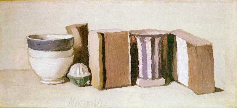
Lately I’ve been drawing a lot of still life, in what I call my perspective ‘sketchbook’. I’ve been setting up still life objects to draw daily and found that it is coming along quite well; I’ve done quite a few as far. Basically I’m using it as not just for 12 hours self-directed study but also primarily to try and improve my rendering ability. Back in College I remember looking at the work of Giorgio Morandi, were he would paint bottles and other still life objects but not the labels stuck on the sides of them.

 
Naura Morta - Giorgio Morandi (1929)
Giorgio Morandi - Still Life with Cups and Boxes, 1951
Still Life with Cups and Boxes (1951)
My style of drawing is will differ from the next person like it does with everyone, the way I see it is that the labels that come on household object such as boxes etc. are not necessary, the way I see is that they aren’t needed because they don’t add anything to the image which is why I like to draw the basic shapes of the objects in perspective then add the lighting in. It feels more ‘cleaner’ and ‘neater’ if you will just like Morandi’s work. I found that the style in which I draw in is quite similar to Morandi’s, he proves that all the detail is that necessary in an image. I personally struggle with drawing logo’s etc. and can’t copy them quite accurately, his style lets you forget about all that, because it’s not always about how much detail you can put in, sometimes you can find yourself getting so caught up in detail you forget the bigger picture. Morandi himself explored composition, placement and different shapes and forms these everyday objects provided as well as lighting.


I’ve also been using the still life to explore composition more also, something I talked about a couple of weeks ago but also something we talked about this week to. I’m trying to set up the still life in a way that I can put the horizon line about 3/4ths of the way up the page but also try to use the rule of thirds so that the placement of the object on the desk isn’t just dead in the centre of the image. If I stand the desk in which the objects are placed on against the corner of the room I can use the lighting of the wall to define the hard edge of the objects I’m drawing, it also allows me a wide viewing angle in which I pick a spot to sit and then draw the object itself which is placed in position so it matches up with the horizon line.


Cicular Still Life

Still Life Box 

It can sound confusing, and it is, composition is still something I’m trying to master, but I feel like I’m slowly but surely getting better at it.

Friday, 2 December 2011

Below

Like Identity, Below was similar in ways. In Identity we looked at the environment and how we can try to make use of a limited area. That film is set in one motel; this film is set in one submarine. It’s similar in the ways of how in Identity the characters were practically stranded in the motel overnight, whereas this one the character cannot leave the submarine unless the want to be killed and be in the middle of nowhere in the ocean. Basically like Identity they are trying to make use of the environment since it is just limited to one submarine with different various rooms scattered around. What is again similar to Identity is that it’s basically a horror film thus the same kind of events take place such as people being attacked and mysterious things happening all the way throughout the film, it was kind of like watching an ‘Identity 2’ in honesty.


The ways it was different however was that the characters are on a mission to rescue survivors, whereas in Identity the characters just need to somewhere to stay overnight as the rain outside is causing flooding, though however I guess you can compare and say it is similar… Similar in the fact that in both situations you can say that it’s dangerous to go outside and then you can say it’s dangerous inside in both situations to… In Identity there is someone going around killing everyone and in Below there is a ‘ghost’ of some sort doing pretty much the same. It’s quite interesting, it’s as if both films have a similar plot but just set in different environments.


Enough of the story though, I thought that this film had good visuals, it’s set underwater all the way through until the final scene , so you expect to see a lot of blue and dark tones of colour throughout. Blue was definitely the most common colour in the film. The odd yellow, green, white, black and grey popping up to and a bit or red. It feels as if every film we watch has the same sort of colour palette.


It’s not until the final scene you sort of get a relief of seeing the same things over and over, but the idea of the whole film set in one location is great and they again like Identity made use of the different areas they were limited to. I’ve never heard of a World War II horror film before so it was nice to see a sort of different side or ‘idea’ if you like brought about the World War in this film.


I don’t know but to say it was supposed to be set back in the 1940’s, it just didn’t feel like it to me, it all seemed a bit to modern but however they captured the sense of fear and danger of being in a war and underwater very well and the ‘ghost’/horror side to it and the costumes they are wearing added to that feel very well I thought.

Wednesday, 30 November 2011

LockStock - Revisted

Last year I wrote more about the story of Lock Stock rather than the Art and development side. After watching it again, this time around I started to see things I missed before. In terms of Art direction it had a strong use of yellow tones throughout, thrown in with a mixture of greys and browns, the odd red and green lighting to but one thing I noticed was how blue kept popping up again and again. Not just blue lighting but I noticed how the characters tended to wear colour quite often.  

The characters are great, the way they act the way they are dressed says it all about them. The really captured the feel of what more modern gangs of London are like. Similar to L.A. confidential, when I talked about how the characters seem to just float onto the stage, in this film the actors seem to barge their way onto the stage with a strong sense of character. What I mean is everyone in the film comes on as ‘I am everything, give me what I want or you’re dead’ attitude.  Almost every character we see is dressed in a smart uniform, carrying a dangerous weapon, with a no-nonsense attitude towards everyone and they all have that deep typical London accent, it makes you scared off visiting London.

I remember saying last time that everything in the movie is about money, guns, drugs, respect and women, which it pretty much is from start to finish. It has a fear factor added to it by this but it tends to soften the strong sense of fear by adding little quirky jokes in quite a lot. There are two characters from the north that are kind of like the jokers throughout the film, they have a scouse accent which I feel is one of the elements of breaking up the hard core violent drama.
The streets of London a dangerous place, I think the film captures these rough streets quite well. Typical grey, dull English streets wherever you go which is where I feel the lighting plays a big role to give it some nice bright colours in the film so where not just seeing dull boring, possibly bleached colours throughout. It was kind of like watching a more extremely violent version of Eastenders, not to get into that too much, but you do even see Phil Mitchell get as angry as Vinnie Jones from the film.
I noticed how reds kept popping up to, it’s as if during the day the saturation is turned down and during the night they turn it up quite a bit. The nights are dark but lit up well which again, I think breaks up that dull feel of natural England.

Monday, 28 November 2011

Year 2 - Week 8 - November 21st - 25th

We kicked off this week by given the task of modelling our War of the Worlds Martian tripods, though I was already one step ahead as I had already finished mine. 

War of the Worlds - Alien Tripod

I knew we was going to have to model it so I got it done before the task had even been set this has allowed me to get on with other work, like my personal work and other outstanding bits I haven’t done yet. I’ve found more time to do more personal work this week and focus on my final pieces.
Coming back to the tripod though I found that when I was modelling it, something’s didn’t go as I had planned and drawn out and found myself having to redesign some of the structure of it on paper. Following this I took the time to make these adjustments on the model and I was quite happy with the outcome.

The assessments are coming up shortly and I’m nervous, I’ve been thinking about it for weeks and I get more panicky as it draws closer. I think it’s fair to say that I have done a lot more work than I had achieved this time last year and also the quality is a lot better (I believe).

LoughBrough Railway Station Final.

Christmas is just around the corner which I’m looking forward to, but it’s not all going to be fun and games as there’s work to be done. I’m hoping that I’ll be able to do a lot of personal work over the holiday break in all areas of the course. I know I probably won’t come out with amazing grades, but I am trying hard, a lot harder than last year that’s for sure. Last year I was doing the work given to us and hardly did any personal work. This year it’s a different story, I said I’m going for it and I am sticking to it. I said earlier that each week I was going to keep drawing fruit each week and also keep a sketch book or personal where I’m drawing things in perspective and I have been doing it. I’ve been placing still life object and drawing them to perspective, I want to explore perspective more however by getting out more and drawing the built environment, which I’ve done for my urban project but would like to try and do more for my personal work.
A year ago at my first assessment I was told to do more work, I took this as doing more of the work given to us not as personal work... In which I spent my Christmas re-doing everything which didn’t get me anywhere in the end as I had done all the mandatory work up to date, I did all this extra work and didn’t gain anything for it by the time I got my results in July, which I was annoyed about. I wish I had spent it doing personal work but because I miss interoperated my feedback I did it all for nothing... This is why this year I’m making sure I’m finding time for extra work, I just hope the extra work reflects in my grades...  
I want to spend this Christmas tweaking stuff and doing personal work in all the modules of the course. In 3D this week we were continuing with the Mortal Engines self portrait project, I’m doubtful that it’ll be finished by the deadline, I’m trying but I’m having the same problems that came up in the gladiator project. I’ve spent way too much time already on the head that still doesn’t look right and finding it hard to set up my camera to get good pictures of myself. I think 3 weeks on this is not long enough, considering we have to make a high and low poly version. One I’ll most likely be coming back to, I mean there’s only ONE person on our course who I know wants to be a character Artist, hardly anyone likes characters, I think it’s because they are complex to model.

Saturday, 26 November 2011

Sonic Generations

Sonic Generations is an absolute must to talk about in my blog! One thing I’ve mentioned a few times in my blog is how we should take older games and give them a chance to become the game they could have never been in the past. With technology advancing, why not give them a chance to live up to their full potential? Back in the day Sonic could only be played on a console that supported 8 and 16 bit consoles until new consoles where made capable of handling better graphics. I live in the past I only tend play the old games because to me they were (in my opinion) the best, it’s the basic roots of gaming (where it all began) not just for me personally but everything started with bits. From 8bit to 16 to 32 to 64 and beyond, it all keeps advancing rapidly, we live in a world now full of HD, Blue Ray and 3D graphics. 

Modern Sonic left. Classic (better) Sonic right.

This game to celebrate Sonics’ 20th birthday, they’ve gone back to the past and created a game where Sonic goes back in time and teams up with him classic self taking on various levels from all the different Sonic games in the past 20 years. When i first heard about all the old levels being thrown into the new game I knew I have to play it and it is simply put something I’ve been waiting for. Trying not to get caught up in the excitement of it too much what I love is that it has took level designs from 20 years ago and thrown them into the a next generation console with gorgeous 3D visual elements, kept the old style of game play and even the music to boot!
Classic 2D Green Hill Zone (Act 1)

The new modern Sonic game play is thrown in to with these old levels, so for example you can play as modern Sonic in an old level where it’s a free roaming 3D platformer but also play the classic retro style Sonic , being a 2D side scrolling level though it it’s still a 3D game.

Modern Green Hill Zone (Act 2)

Sonic has always had that cartoonish style to it, which is what I like but in recent years they have gone a bit off it in terms of Art direction, giving it a dark gloomy atmosphere everywhere which makes me feel sick (personally) and it feels as if this bright blue hedgehog doesn’t fit in with the more realistic looking environments. It’s great to see the old style back again though, they should have never changed anything in honesty, and they should’ve just kept it going the way it was until everything went 3D, it’s still good but even in the media people are slating the more newer games, but I think this game will make it in everyone’s good books this time around.

Classic 2D Chemical Plant Zone
New 3D Chemical Plant Zone

Sonic means a lot to me since it was the first game I ever played, which was the 8bit versions for the Sega Master System II and for 8 bit a lot of people would agree that its better than Sonic 06 (or Sonic 2006) for the Xbox or PS3, the game was rushed and it was horrible, a lot of things in the game don’t make sense and even the modelling in the game doesn’t make sense for example there’s a cut scene where Sonics’ hand looks bigger than his head (I’m not kidding). Why I think it’s rushed is because they wanted to release the game in time for the PS3 console release as one of the debut games, I bet they wish they spent more time on it though. Sonic 4 was the continuation from Sonic 3 which was released nearly 20 years ago and just last year it was released adding to the old series in 3D and they nailed the Art direction spot on from that, it sort of suggests the franchise is going back to its basics instead of getting way out of hand which I’ve seen in the last 10 years.
Sonic 06 (Doesn't do it for me!)

To sum up Sonic in recent years hasn’t been that good in terms of story which as you know can affect the Art in the game etc and personally I never liked it that much, but I think this game puts it right back up there with the best of Sonic. Only thing I want them to do now is to remake the all the old games one by one in 3D but I’ll have to keep dreaming for now...

Year 2 - Week 7 - November 14th - 18th

This week we are drawing the urban environment.  Looking at the built up areas around Leicester and using perspective to help produce the work, similar to the 2 point perspective project in year 1. For me I like doing this project due to the fact that it’s about looking at perspective and everything in the built environment is blocky and square basically. This is the kind of things I like to draw since I cannot stand organic shapes and especially drawing trees! I could draw built environments all day long; I’ve gotten to like architecture quite a lot so this project is perfect. Recently I’ve decided to keep a sketch book based on perspective drawings, so basically drawing the built environment or blocky objects in perspective. I understand perspective a lot and beginning to be quite obsessed with it applying it in nearly everything I draw. Something I struggle with is textures, I can’t render them to save my life, I just apply lighting wherever I see it to what I draw and that’s enough for me. I don’t know what it is, I can draw pretty much anything but no matter how hard I try and even researched on how to draw textures better... I just can’t, I’m trying to understand but can’t. My style of drawing, painting and adding tone I would say is quite different from others, the main thing to remember is that there isn’t just one way to draw, paint or even sculpt etc, we all have different styles so I’m not going to let it get to me. One thing we’ve been told is that we can add a bit of stylisation to our work which I thought we could anyway... I got confused by this, in which I thought we could stylise any drawing we wanted already, I think I understand it means we must draw in our own style and can only add a bit of others styles...


The Urban Environment

In 3D we’ve started on our self portrait project, this is the one I’ve been dreading because not only do I hate taking pictures of myself or people drawing me, but modelling myself seems a bit too far for my liking... How I plan to do this project is by making a high poly versions and then taking out edges and vertexes to where not needed to make the LOD version. I’m going to need all the time I’ve got on this since I hate modelling characters, ever since the gladiator project it made me never want to model or design characters ever again!
No critical studies again; one thing I wanted to talk about was the Concept Art workshop from week. It was good to hear about things from a former student about life in industry, I thought being a concept Artist would be a cool job to have before I came here but I wasn’t too sure about it, in terms of what more do you do in the job role other than drawing, and as it turns out you do a lot of 3D speed modelling work and manipulate images from 3D to put into 2D and paint over them which is cool, it would be good to use that technique possibly in the Queens building project coming up soon. Mitch (the guy who came in) talked a lot about the planning and processes of what it takes to be a concept Artist, he even said that you get told that your work is total crap quite a lot so it’s heart breaking, which has definitely made up my mind of not wanting to be a concept Artist, I couldn’t handle that, I want to work in a nice friendly environment (if it exists!) not a harsh one where I’m being told whatever I produce is crap all the time...
He even said that they cheat all the time in their work, which I was quite shocked to hear, but I guess when you get to industry level you can do whatever you want...

Friday, 18 November 2011

Y2 - S1 - T16 - Elements Of Game Design - Part 7 - Level Design

When it comes to level design you need to consider all the key aspects of what the level needs and has. Previously I think I explained about how sometimes the script and story of a game or even a film has an effect on what may be needed for a scene. For example what is written down will need to be considered as it is all a part of the actual story. For one thing you’ll have to take what is needed, I talked earlier in my blog about the original Pac-Man and how it’s simple and effective but needs to be worked out. For example in all 4 corners of the maze are special pellets that allow Pac-Man to eat the enemy, so they are specifically placed in the furthest out of the way places to reach. If I were to compare this to another such as Grand Theft Auto there may be in a certain place you need to get to in the game to retrieve a special kind of weapon for example that is then specifically used to destroy or kill someone (as an example!). So planning out where these are going to placed is vital but then you would have to think about where you specifically start the level, where the level ends, what you must do to get to that certain point, what happens in the level, what if you fail the level? Etc.
 
Grand Theft Auto : San Andreas

In both games the outcome can be random, but the thing you have to think about what are you trying to achieve with this? , what do you want the player to do? , how am I going to layout the level in order for these events to happen and take place? Maybe there’s a cut scene that takes places at a certain point but how am I going to get the player to that location to see it? I think a lot of people do tend to forget about the planning of a game level, the Artists will make the required assets for the game but it’s also good for them to have an understanding about what is going on in the game for example there maybe something specifically important for them to build which is a vital part of the story, background or characters etc. or maybe it is something that adds to a part of the script for later. In a game like Grand Theft Auto you have to consider everything you need because it’s just ONE entire country you play through with different various missions, whereas when you take a like possibly like the original Sonic the Hedgehog it’s not just one world all the way through, it’s a different level all the time from one to the next, the objective is the same but the level changes and you get different worlds etc.

The ONE and ONLY map of GTA San Andreas. The arrangement of assets is very important, it’s all just one design with missions to complete scattered around.

 
The many various levels of 16bit Sonic the Hedgehog, different worlds different stages different designs!

Even though I am comparing a 2D side scroller and a 3D game it doesn’t matter because you can see what I’m saying is that it depends on the game design which then affects level designs. The look and feel of the game is all dependent on the game design. Not only this but you have to think about the mechanics of the game itself for example, the character you are controlling, the way they move, the feel of the gameplay, are you just one character all the way through or can you be many different characters?

When your planning and concepting, white boxing can help get a feel for what you want, taking what you’ve drawn down and putting into actions to get a better feels of the game itself, from there you can take out or add bits in that do or don’t work. As an Artist when your given a brief you want to think about what you are making, what its used for and how is this going to work in the game? Not just in 3D but even in the days of 2D, 8 and 16 bit graphics game designers and Artists have to work together to work out what works and what doesn’t. They can make huge levels and scrap them completely because there was one flaw that just didn’t work and would have had to redo the entire thing. Planning processing is critical, it is better to white box and test a game first before going on to texture and make the completed final asset else all the work done can be done for nothing and must be done all over again.


Talks about prototyping in the Sonic 2 (16bit), how quite a lot of things were cut out and dropped from the final game, levels and worlds especially. Talks about how some concepts were made but didn’t follow them all the way through, and also says how some worlds and levels didn’t even make it past the concept stage. It even says how they had a ‘time travel’ concept for the game and were going to introduce other levels related to that concept but then dropped it when the ‘time travel’ concept was abandoned.

Y2 - S1 - T15 - Elements Of Game Design - Part 6: Visual Composition

Personally, lately I have been looking at how mathematics can be applied in Art. In terms of visual composition I believe that mathematical shapes and equations can come into Art to make up the images itself. Take the work of Da Vinci for example and look at how he made the Mona Lisa. It was purposely made by using what is known as golden rectangles and when you look at the image with the rectangles overlapping you recognise that the shapes rotate around in a clockwise spiral. 

Golden Rectangles
Mona Lisa - Leonardo Da Vinci - 1503 - 1519

It’s basically one big rectangle with smaller and smaller ones inside; I think it’s a very clever process for working out a composition, being a mathematician and all it gave Da Vinci a way to experiment with applying different shapes to a canvas. There are so many different things you can see in it however, for example it’s a portrait quite simply put and so you can see a central triangle in the composition.

Not just in this but even in his other, most in particular ‘The Last Supper’ there’s lots of what people call ‘sacred geometry’ and hidden meanings behind the paintings, which is where ‘The Da Vinci Code’ comes from I guess. When I look at it I think yes there is a one point perspective in the middle of the image, edges are aligned up to it going outwards as in any perspective drawing. But then it gets to the people and how they are arranged, people have many theories on the image for example what does it incorporating without us know it’s there. I’ve read that he image is split up into 12:6:4:3 ratios where the different elements in the image are split up into different units, such as the windows and walls etc.  Though this is a made up image allowing him to experiment.
The Last Supper - 1495–1498

It’s a really interesting composition though, when I am ready to create a final piece I look at the perspective and ask myself what do I want in the image, for example I don’t just want to place the single vanishing point directly in the center, as I’ve done that before but I don’t think it good to have the main focal point there, so maybe I’ll move it to a different position and use the rule of thirds to gain a better composition. In my War of the Worlds work I basically looked at different shapes and then made orthographic views of the Martian tripods. I did this however by using an 8x8 grid to help me for each one of them. I’d create a rectangle box then create an X shape from corner to corner to allow me to split the box into 4 and then repeat the process again to create an 8x8 grid. This then allowed me to use specific points or coordinates on the grid to mark out where I wanted to place my outline work of the concept and gain perfect symmetry between both sides of the design. From creating a front view first it then helped me to mark out the exact same points on the side view (though it can be done either way) and then I can work out a sense of  depth from it which then can be applied to a perspective view of the design. From gain X and Y coordinates I then must work out the Z axis coordinates which is where it gets confusing but helps towards making a perfectly accurate two point perspective view of the thing itself.
War of the Worlds ideas work. Using the side view I work out how the front view may look matching up the specific points on the 8x8 grid. Good for working out composition.

What I’m basically trying to say is that the placement of objects doesn’t need to be worked out by Artistic judgement; it can be worked out accurately using mathematics and shapes in perspective. When I use to draw at a younger age I knew nothing about perspective and used primarily my Artistic judgement for everything, back in a time when I thought you had to be born good at Art. Now-a-days I like to be more precise about drawing and modelling though there’s not always time for spending ages working out things, so looking at objects in relation to each other is important, when looking at landscapes it’s important to look for the horizon line and your perspective and when looking at even organic forms and characters looking at foreshortening to help work out scale, height and proportion on different parts of the body. Once thing I think has the biggest impact on all this is the angle in which you view something, so sketching out different angles, or taking photos and being a cinematographer is all relative to making a final image. 

 When you draw something in 2D you probably want it to look 3D which is where perspective comes in. If you want it to be exactly 2D then you'll be looking at orthagraphic views of whatever it is, however what I'm saying is when you want to turn 2D into 3D it's good to look at the 2D orthagraphics first then use them to help you create a 3D image or you can just use you own quick Artistic judgement in perspective by using a horizon line and vanishing points there are different ways of working things out.

One last thing: A theory video on Da Vinci's work I found quite a while ago:

Wednesday, 16 November 2011

Year 2 - Week 6 - November 7th - 11th

The war of the Worlds is the subject of this week’s visual design project. It’s a good way to get us ready for existing game series and companies that make them. It’s something that’s got me thinking a bit more, even if you went into an existing company as a game designer, programmer etc I think it would be important to know quite a bit about the game you are helping develop. For example I go into industry and I’m asked to work on a new Mario title for Nintendo would they expect me to know a lot about Mario already? Or would they brief me in if I didn’t already know anything about it? I’m pretty sure they would say what the game is about, what previous games in the series were about and how it worked. As an Artist, it (I’m assuming) would be about knowing the Art style and look and feel of a typical Mario game, though for a programmer I’m sure they would maybe have to know a little about how previous games were coded and as a game designer again look at past titles in the series and go from there.

Besides all that, we are looking at the Martian tripod design and listening to the 1938 radio broadcast. I’ve never watched any War of the Worlds film nor the most recent 2005 film though I have seen parts of it; it’s one of those things I’d never personally want to watch. There are really not that many images from the 1930’s to look at so that’s why we were listening to the 1938 broadcast, it’s hard trying to design something that looks like it’s from the 1930’s however, from what I’ve seen everyone is drawing things that look more modern, though upon researching you can render things to make them look more 1930’s. I’ve got orthographic views on each of my designs, I want to make a perspective image of one as the final concept and then I’ll be already for sculpting the thing itself. It’s the same process for the vehicle, (Imagineering) planning and concepting again.

In 3D I finally finished the trash project, I wanted to improve all my stuff so I may come back to it or do another project based on trash, I may even do another treasure chest. I got the project done early, I set myself 2 weeks instead of the 3 given for it so I could spend time on other work and make tweaks and improvements. I’m managing my time, I've started to keep a sketch book on perspective for example I’m taking still life objects and placing my in different positions angles and drawing them, I’m also stating to draw a lot more places out and around like what we did for 1 and 2 point perspective last year. I believe anything including the human figure and trees can be drawn in perspective, why I say humans and trees in particular is because some people believe organic shapes can’t be drawn in perspective but the truth is anything can. I like to draw things in perspective all the time now, just doing simple line work, I can draw anything you would want me to, though one thing I need to get better at is my rendering however.


Friday, 11 November 2011

Collateral

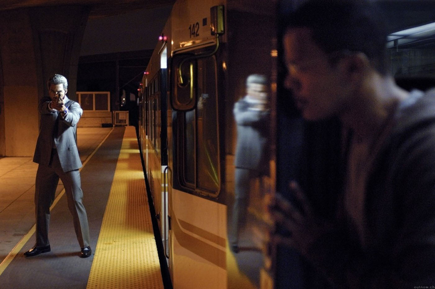
Really enjoyed the film Collateral. Like the previous film we watched again this one was all set in one night, however the difference between Collateral and Identity was that the setting wasn’t limited. The opening scene was the cab driver (Max) is driving a woman (Annie) to a location in which by the end of the scene he gives her a picture that means something to him and tells her to keep it, by that alone I assumed that the film is going to end up being all about the woman in the end and I was right. Just like in the last film I was right from the start. It’s a very dark setting again because it’s set at night throughout the film so I think that in terms of Art direction it was important to make use of the city lights. Tom Cruise plays the role as Vincent who employs Max drive around the streets of L.A. all night killing witnesses at various locations, in which they make use of the streets of L.A. by going to different buildings scattered around encountering various problems. The typical streets of major places in America like L.A. and New York etc. have bright city lights everywhere you go (or at least that’s what I’ve seen on TV and movies) so I think that it was important to make use of them in different scenes and shots simply because it’s dark all the way through and they need something to lighten the atmosphere up and as the plot unfolds the main characters make their way through the concrete urban jungle that is Los Angeles.


The colour pallet like all previously had a limited amount of colours used varying from greens, blues, reds, yellows and more paler but light colours I think again were used to add but to also capture the feel of the modern street of L.A. as the film is set in the year 2004.


After driving around all night it gets to the point where (as I predicted) Annie is one of the witnesses that Vincent needs to take out as he is hired to do so, and so it’s Max to the rescue.  Luckily he keeps the phone number given to him by Annie so he can call and warn her about that Vincent is coming for her. Max and Annie eventually escape, though however they are chased onto a metro rail train by Vincent in a desperate hope of getting away it ends as Max kills Vincent and then I guess they all live happily ever after? I’m being sarcastic, but it reminds me of L.A. confidential not in the sense that it’s all set in the same place but because of the plot is all about murders and crime etc. moving in and around the city. I remember the scene where they are in a night club and the lighting is very blue and they captured the feel of what a modern day night club in L.A. looks like though then again it’s not as hard to capture the modern day feel because we are living in the modern day… but they got it right! It would have been harder to produce L.A. confidential because they trying to produce a setting from 40 years ago at the time of production. The costumes and environment to be honest was very different but that is simply because one film is set in 1950’s L.A. and the other 21st century L.A., and you can tell the comparison between both dates. I for me they captured right. it was a great film and I’d definitely watch it again.

Identity

Identity was all about environments. From the off I noticed the colour palette straight away, which is becoming something I’m always noticing straight away in all the movies I watch now. It was very dark as per usual with any film, I think it’s a big cliché to be honest but every film I watch seems to have darkness everywhere, even in games everything is dark, it’s probably to add a more dramatic atmosphere but I get kind of fed up with seeing it over and over again however this film is set all in one night so I’ll let the concept off with this one... Without getting too much into that though the colours used were again limited. Different tones of green, red, yellows here and there and blue were all the colours I noticed mostly. Another thing was looking at the greens in particular; they varied from a darker green to a higher saturated green in different scenes giving a varying contrast all the time which was interesting. I thought that these colours tend to draw my eyes straight to them more rather than focusing on the characters and what they were saying or their facial expressions as with it being a horror movie the actions of the characters are important to how the story unfolds I think.  Though being an Art student I tend to focus on what the aesthetics look like for example different shots and camera angles etc more than the story itself.
 

The environment was very limited, the whole film is in just one place and it all takes place in one night. The story and script have an effect on the Art direction I think in terms of it being all set in one motel in one night, it’s constantly pitch black outside and all around and it’s flooding around them therefore the characters cannot physically get away from the motel because of the constant rain and the danger of it and so they are forced to stay in the same place the entire film, there in which it asks the questions to the Art director of what can they achieve with this? The Artists are basically limited to the scenery; there are only so many rooms they can work with so it has to be well planned out. I guess the script to the story will help them realise what rooms are needed and what parts of the set will be used by the characters and what purpose they are used for. So based on that it kind of all boils down to reading and working with the writers (I think) closely to describe what will be going on in each individual scene and then from that work out what is required and how they are going to shoot each scene.

 
I remember the scene where the injured woman is lying in bed, you see that room quite a lot for a while but afterwards we start to see more of the set. It’s as if they don’t have a lot to work with so they were trying to make scenes last quite a long time in one area and then build it up to seeing more and revealing more to the story as time goes on (again I think). The scene where the woman is hit by the car is quite a long scene, as it repeats it over twice. When I heard that it was a horror movie and people started to get killed, at the scene with the young boy in the car and his mother outside gets hit by a passing car at the start of the film, I immediately assumed that they boy was the cause of her death and knew it was going to be him from the start and I was spot on. Maybe I’ve seen too many cliché horror movies? With most of them you know who it is from the start and this was one of them. In terms of environment it’s great, Art direction good, story good too but it was quite predictable to be honest (and again this is what I personally think!).